The Skin of a Living Thought
In the 1918 Supreme Court decision Towne v. Eisner, Justice Oliver Wendell Holmes wrote the following:
“A word is not a crystal, transparent and unchanged; it is the skin of a living thought and may vary greatly in color and content according to the circumstances and time in which it is used.”
The word in question at the time was “income”, and the discussion was over whether or not the plaintiff had paid the appropriate taxes. The plaintiff argued that he had paid more tax than was necessary and that his actual income was less than what the IRS claimed. The question could not be answered without first agreeing on what the word “income” meant, so Holmes wrote these eloquent lines about the nature of language.*
By describing a word as the skin of a living thought, Holmes gave a physical human attribute to language. In doing so, he acknowledged the degree to which language is an embodiment of ideas. Like all things with bodies, language changes over time and in different contexts. Most of us are familiar with this, and we effortlessly pick up on the subtle differences in the meaning connoted by a single word when it is used in different situations.
Holmes also wrote about the changing color of words, and so he brought the topic of visual perception into the equation. Interestingly, our perception of color itself is also dependent on context. Josef Albers famously wrote about this in his book The Interaction of Color, and he showed how one color looks radically different depending upon its surroundings. In the image below the double x shape is the same color all the way through, but it appears to shift in tone because of the other colors around it.

In my experience this same thing is true of entire pieces of visual artwork. The context in which we see a piece of art changes our perception of that piece even though it does not change what the artist meant to communicate. For example, the first time I learned about the artist Henry Moore I was in college and looking at a picture in an old book – a black and white picture if I remember correctly. I don’t have the book anymore, but I remember my impression of it. I thought the sculpture was mysterious and modern, but I couldn’t get my head around it (literally or figuratively since it was printed on flat paper).
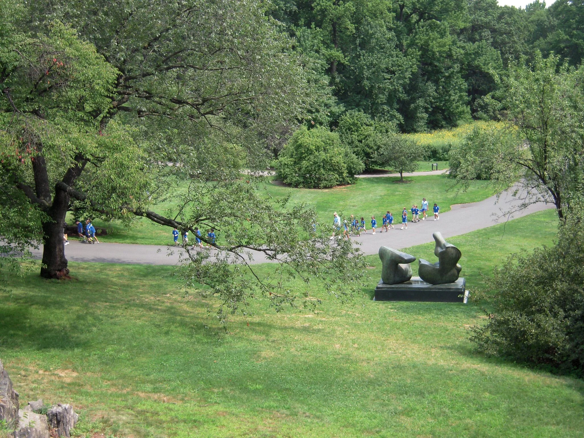
A couple years later I was living in New York City, and I kept seeing images of Moore’s sculptures printed on the city buses. It was 2008, and the busses were advertising an exhibition at the New York Botanical Garden called “Moore in America”. Twenty of his gigantic sculptures had been shipped over from England and artfully positioned throughout the garden. It was an appropriate way for them to be shown, since Moore himself believed the work was at its best out in nature. He said:
“Sculpture is an art of the open air… And for me its best setting and complement is nature. I would rather have a piece of my sculpture put in a landscape, almost any landscape, than in, or on, the most beautiful building I know.”
For several weeks I was too busy to actually visit the garden, so I only saw images of the work in little flashes as they flew by me on the ever-moving busses in the bustling city. When I finally did take the train all the way up to the garden in the Bronx, I was struck by the stillness and quiet I felt once I arrived. I was among a small number of weekday visitors to the garden (with the exception of some school groups), so I was almost alone with these Brobdingnagian bronzes. I could walk all the way around them and peer into and through their many carefully hewn holes and internal forms. The sculptures seemed comfortable lounging in the capacious garden as if they had been made for the place rather than temporarily loaned to it.
Henry Moore, Two-Piece Reclining Figure: Point 1969, Bronze

Henry Moore, Reclining Figure: Angles, 1979, Bronze

Henry Moore, Oval With Points, 1968-70, Bronze
My view of Moore as a sculptor was richer than it had been before this trip, because rather than reading about him or seeing images of his work, I had experienced the sculptures themselves in a contemplative setting.
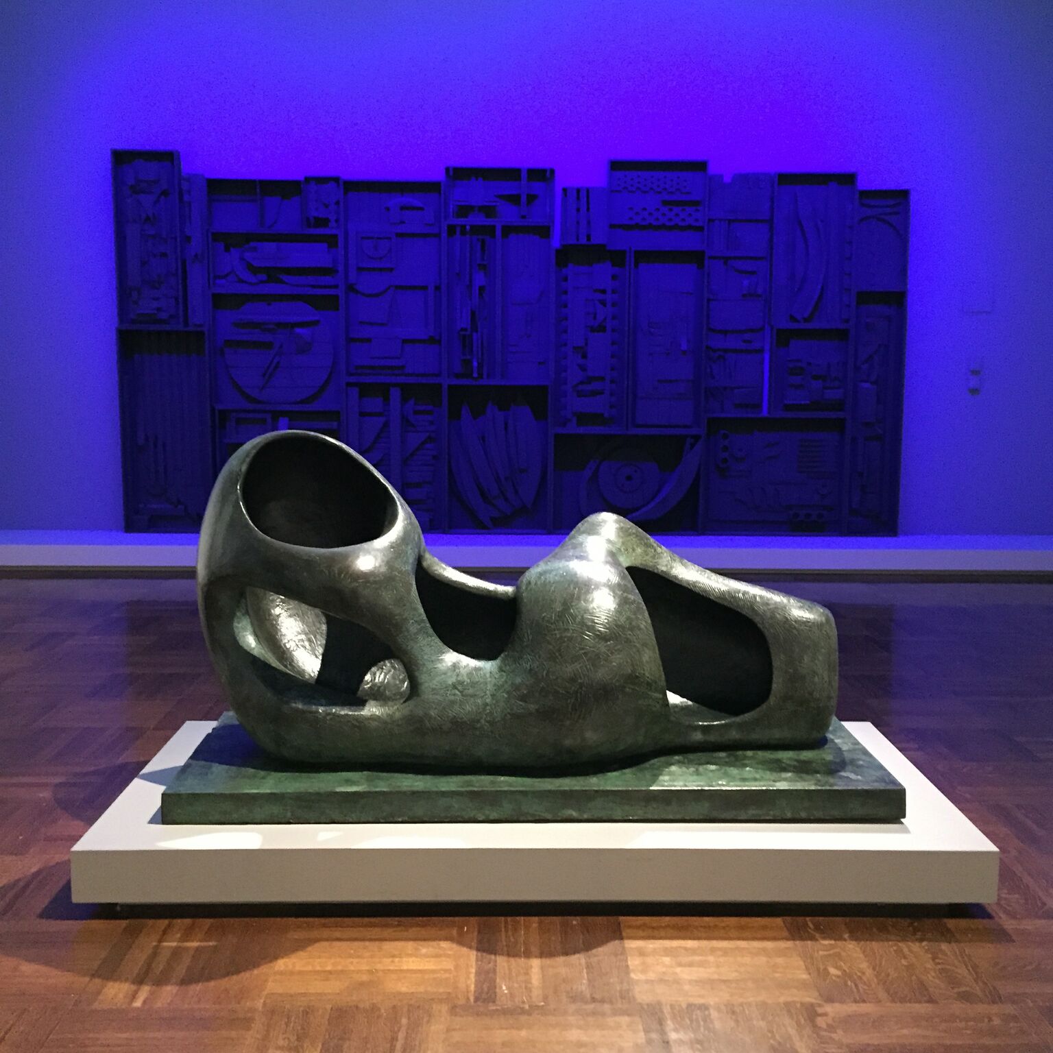
Since that time, I have seen Moore’s work in many places, but one other instance stands out. About six weeks ago I was at the Toledo Museum of Art with students. As we were about to leave I hurriedly walked through the modern section of the museum and saw a Henry Moore sculpture in the middle of one of the galleries. It was smaller than those I had seen at the New York Botanical Garden, and the room was partially filled with bold, purple light. The purple light was directed at another piece, but because the space was small the Henry Moore sculpture was bathed in artificially bright color as well - hardly the natural, outdoor setting Moore would have chosen. The sculpture had a strong enough presence in the space, but it seemed a bit smothered, and I could imagine that if it were a sentient being, it would be craving the “open air” Moore thought it deserved. Between the atmosphere in the room and my own feeling of hurry, I simply could not appreciate his work as I once had.
Henry Moore, Reclining Figure (External Form), Bronze, 1953-54
Later, after leaving the museum, I read a bit more about that particular sculpture and discovered that before the Toledo Museum of Art purchased it, Moore kept it outdoors in the garden of his house and studio in Hertforshire, England. I suspect its original home was a more natural environment for it.
Moore’s sculptures are often reminiscent of figures even when they do not explicitly represent them. In that way his sculptures are also like the skin (and flesh) of living thoughts. Since his work is often shown in public spaces, the question of context is a natural one, but it is also one that Moore can no longer control. Since his death in 1986 he has left us with a body of work (a body of work!) that we can ship across oceans, photograph, and print on the sides of busses. We can write about it, draw cartoons about it, and inevitably at some point we will accidentally damage some of it. Because they are large and made out of materials like bronze and stone, his pieces are unlikely to be completely destroyed, but they will almost certainly develop new meanings to new generations. And yet, like words taken from one language into another, they will likely retain some vestiges of their original meaning even as their primary definitions shift.
In one sense this is humbling both to artists (whose work will likely be misunderstood some day) and viewers (who are almost certainly misunderstanding what artists of the past meant to convey). But one could also interpret it as a reason to keep making and keep looking. There are words in the English language that no longer mean what they once did but nevertheless serve an important purpose for speakers today. The word “president”, for example, once meant little more than “foreman”. Its meaning has grown as the role it represents has also grown. In the same way, we do not always know what role a given piece of art will play in the lives of future generations, but it is not impossible that the role will be even greater than the one the artwork has today.
* I was alerted to this quote when I listened to the wonderful podcast Way With Words this past week. Check out their website if you like that sort of thing.
A Blue Pigment for Mary
Victoria Finlay's Color: A Natural History of the Palette has been on my nightstand table for the past couple weeks. The book is a travelogue structured around the colors of the rainbow. Finlay travels to places where historically significant pigments (such as Carmine Red or Yellow Ochre) were originally used or created and then tells the stories she discovers behind each color. These stories often include elaborate recipes which artists of the past used to create the colors on their palettes.

Naturally, since I'm in Italy right now, I'm drawn to the parts of the book where she writes about this country and the artwork here. In her chapter on the color blue, Finlay writes about Ultramarine pigment and answers the question of why painters often showed the Virgin Mary wearing this radiant shade. Basically, it comes down to money. Ultramarine (or Oltramarino, meaning "from beyond the seas") was made from lapis lazuli stones, which are found in only a few parts of the world and are tremendously expensive. The vast majority of the lapis lazuli in Western art was imported from Afghanistan, so an Italian Renaissance artist who chose to paint Mary's robes with Ultramarine was honoring her with an extravagant and exotic color.
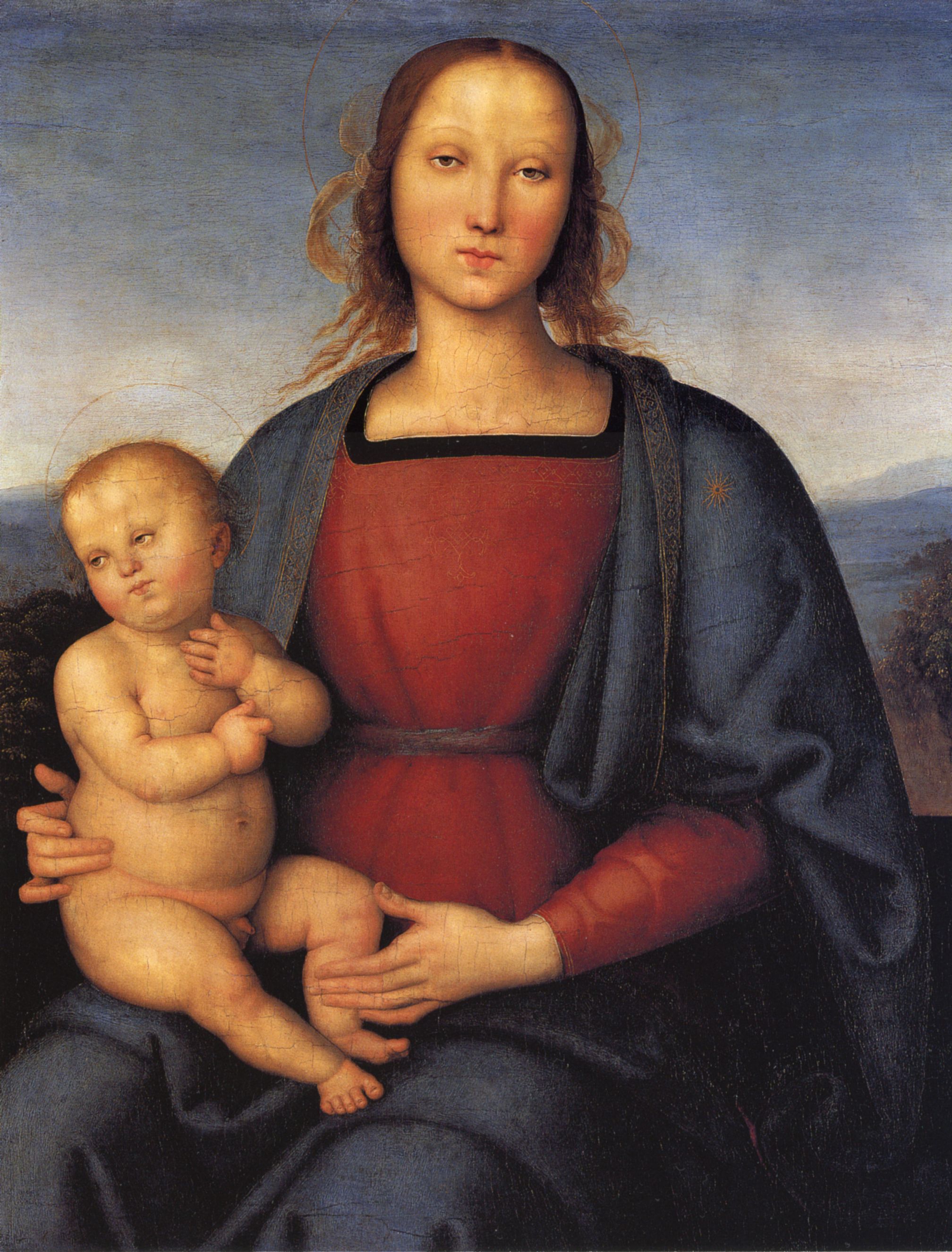
Pietro Perugino, Madonna and Child, 1500
Of course not every artist or patron could come up with the money to buy lapis lazuli, so there were substitutes. Even these cheaper colors, however, followed in the tradition of using blue to honor Mary. For example, some artists used the mineral azurite to make an inferior blue pigment which, unlike Ultramarine made from lapis lazuli, would fade over time.
It is one thing to read about the significance of blue in Italy and quite another to actually talk about it with the people here. By chance, I happened to have just such a conversation with Marina Merli and her mother Adria at the Arte Studio Ginestrelle. The three of us were talking, and Marina mentioned that the color blue symbolizes the Virgin Mary. When I indicated that I find this very interesting, she showed me the table that her mother ate at when she was a little girl growing up in Umbria. It's a lovely, if slightly worn, shade of blue.

Adria Merli's Blue Table at Arte Studio Ginestrelle
As we talked more I discovered that it was common for people in this region to make their own homemade blue paint from local materials. The blue Pervinca (Periwinkle) flower grows wild in Umbria, and, along with some other wildflowers, it was dried and ground into a power. This blue powder could be made into a light or dark blue pigment, depending upon how much lime was added to the mixture. Marina also showed me a small chair, one which had belonged to another family originally, in this darker shade of blue.

Blue Chair at Arte Studio Ginestrelle
Following in the tradition of the great artists who had painted with expensive lapis lazuli, the families who painted their furniture with this homemade wildflower blue were also honoring the Virgin Mary. The difference is that their blue is inexpensive and local, not costly and foreign. While it may not have the permanence or the saturation of its flashier cousin, the simple blue on these tables and chairs is nevertheless a lovely dedication to a holy woman.
It seemed like a delightful coincidence to me that I would discover this story about a blue pigment from Umbria even as I was reading a book about pigments from foreign places and times past. I'm not sure if I was more alert to the possibility of there being such stories in these hills because I had just read Finlay's book, or if I would have come across the story anyway. Regardless of the answer to that question, I'm grateful to the Merli family for sharing with me.
Related Posts